GSD
How to Build Reusable Components Using React
Posted by Nirmalya Ghosh on October 6, 2023
Your website comprises a set of building blocks. These building blocks get a set of data and the main job of these blocks is to show that data in a form that your users would understand. These blocks have to be reusable so that they can be used in multiple places on your website.
You can consider buttons, navbar, footer, tables, forms, etc. as the building blocks of your website. When you build a website, you want to build these building blocks once and reuse them multiple times in your website. You would also want the design and experience of these building blocks to be consistent across the entire website.
React is a JavaScript library for building user interfaces. It helps you in building these blocks which can be reused across different parts of your website. You write the code for the building blocks in a declarative manner and React takes care of efficiently updating and rendering the correct data on your website.
Table of contents
What is a reusable React component?
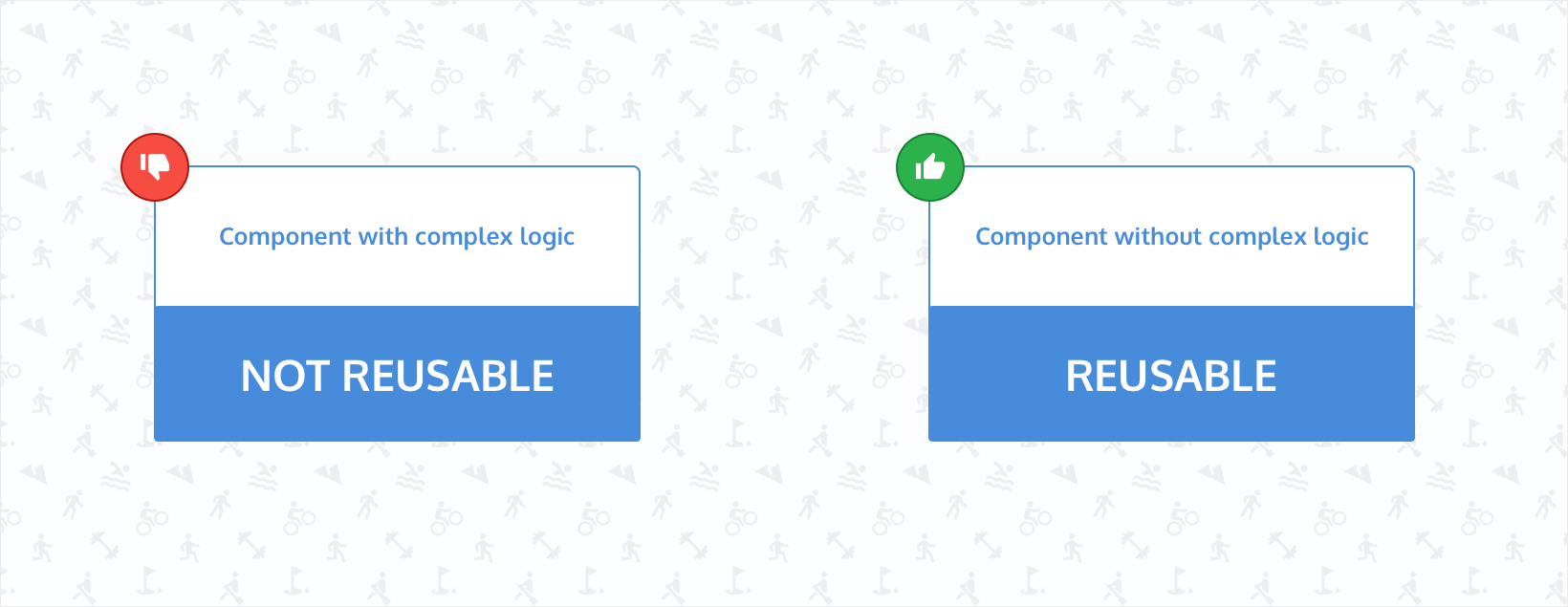
Reusable React components are those components that are pure and predictable. These components are free from complex business logic and are generic in nature. Based on the data that is passed to these components, they should render consistent user interfaces. If the same data is being passed to these components, they should always render the same interface.
Indicators of when your React component can be made reusable
For a React component to be reusable, it has to be free from any form of side-effects like data fetching, interacting with the `localStorage`, etc. This is because the result of these side effects is unpredictable. When data is being fetched in a component, there isn’t any guarantee that the data will always be the same. As a consequence of that, the component might not be reusable.
However, you would want the components like buttons, navbar, and footer to be consistent across the whole website. The best way to do that is by making these components reusable. In that way, you can import and consume these components in multiple parts of your website.
The following indicators will give you a better idea to understand when you might want to make your component reusable:
Repeating the same styles
As an example, consider that you have built a `BlueButton` React component with the following code:
import React from "react";

const BlueButton = () => {
  return (
    <button
      className="padding-2 shadow-none hover:shadow background-light-blue hover:background-dark-blue"
    >
      Click here
    </button>
  );
}

export default BlueButton
Now, you need to create another button but the red color. So, you can create another component and call it `RedButton` with the following code:
import React from "react";

const BlueButton = () => {
  return (
    <button
      className="padding-2 shadow-none hover:shadow background-light-red hover:background-dark-red"
    >
      Click here
    </button>
  );
}

export default BlueButton
In the above two button components, you can notice a lot of style duplications. Apart from the color, the two buttons behave exactly similarly. So, you can create a component called `Button` and pass the necessary props to make it reusable. The code can look like the following:
import React from "react";

const Button = ({
  color
}) => {
  return (
    <button
      className={`padding-2 shadow-none hover:shadow background-light-${color} hover:background-dark-${color}`}
    >
      Click here
    </button>
  );
}

export default Button
When using the above component, you can pass the `color` prop and that should take care of the background color of the button. You can also add a fallback color in case the prop isn’t passed to the component:
....
const Button = ({
  color = "blue"
}) => {
....
Now, if the `color` isn’t passed to the `Button` component, the rendered button will be blue due to the fallback of the prop.
Hardcoding texts instead of passing them as props
In the above `Button` component, you can notice that there is one more issue that makes the component less reusable. The label of the button is hardcoded inside the component. As a result, the component can’t be reused with a different label. To make it more reusable, you can pass the label as a prop. The component will look like the following now:
import React from "react";

const Button = ({
  color,
  label = "Click here"
}) => {
  return (
    <button
      className={`padding-2 shadow-none hover:shadow background-light-${color} hover:background-dark-${color}`}
    >
      {label}
    </button>
  );
}

export default Button
Now, the `Button` component can be reused in different places with a unique label like the following:
<Button
  color="blue"
  label="Click here"
/>
However, if you want to pass a text with an icon, you can’t do that in the above component. To do so, you can accept the `children` prop of React. To do that, you can modify the code of the `Button` component to something like the following:
import React from "react";

const Button = ({
  color,
  children
}) => {
  return (
    <button
      className={`padding-2 shadow-none hover:shadow background-light-${color} hover:background-dark-${color}`}
    >
      {children}
    </button>
  );
}

export default Button
You can now use the component in the following way:
<Button
  color="blue"
>
  Click here
</Button>
You can also pass an icon now in the `children`:
<Button
  color="blue"
>
  <SendIcon /> Click here
</Button>
Calling the same API from different buttons
Consider the scenario where you have a button inside a form which calls an API on click. Your code might look like the following:
import React from "react";
import saveNewUserData from "../api"

const UserForm = ({
  color,
  children
}) => {
  return (
    <form>
      <input type="text" placeholder="username" />
      <input type="password" placeholder="password" />

      <button
        className="blue"
        onClick={() => {
          saveNewUserData();
        }}
      >
        Submit
      </button>
    </form>
  );
}

export default Button
In the above form, you can view a button that calls the `saveNewUserData()` function on click. However, the `saveNewUserData()` is used frequently in the app inside different buttons.
Now, if you want to change the `className` of all the buttons that call the `saveNewUserData()` function, you will have to do it in multiple places. This issue can be fixed if there is only a single button that calls the `saveNewUserData()` function. You can create a separate `SaveNewUserButton` with the following code:
import React from "react";
import saveNewUserData from "../api"

const SaveNewUserButton  = ({
  color,
  children
}) => {
  return (
    <button
      color={color}
      onClick={() => {
        saveNewUserData();
      }}
    >
      {children}
    </button>
  );
}

export default SaveNewUserButton
Now, there will be only one button that encapsulates the calling of the `saveNewUserData()` function and can be managed easily. In case you want to add new functionality when a user clicks on the button, you will have to update a single component.
Reusable react components vs templates
You might have come across many ready-made React templates which can give you a head start on your project. These templates consist of multiple smaller React components. These templates can potentially leverage reusable components to give a consistent user experience. Some of these templates can be found at the MUI Store as well as popular marketplaces like Envato.
Instead of creating a project from scratch, you can get a decent head start if you use these templates. However, when you want to build your own brand which includes having a specific design and experience for your website, using templates might not be the right approach. You might need to create reusable components from scratch based on your designs and the expected experience of how the components will behave or interact.
You can however start with a template and modify it to suit your needs. However, if you have your own design system, it might be difficult to modify an existing React template.
Benefits of reusability
Consistency
When building a website, you want to create a consistent user experience throughout the entire website. Reusing components is one of the easiest ways to produce this consistency and thereby, a good user experience. The interactions and behavior of the reusable components increase the familiarity of the website.
Gentle learning curve
When improving a feature in an existing code base, developers sometimes struggle with the learning curve. This is because they have to figure out how the building blocks or components interact with each other and how the data flows between them.
If the APIs or props of these components are consistent via reusable components, the learning curve is much more gentle. This is because once they figure out how a component works, they can easily add new functionalities to all the places where the component is being used.
When the code base is smaller, there won’t be many issues if you don’t reuse the components. However, as the size of the codebase grows and multiple developers start working on it, the development experience will worsen if you don’t reuse the components in multiple places on your website.
Faster time-to-market
If you reuse components, the amount of code needed to ship a new feature will be much less. Once you have a decent amount of components made you may no longer have to start from scratch whenever you want to add a new feature. This can often result in a faster time-to-market.
If a website is a combination of components being reused over and over again, the amount of time needed to ship features decreases. This is because once you develop a component, you don’t have to build it again from scratch. You might have to improve the functionality of the already-built component or add new features in it but you won’t have to build it again from scratch. For example, once you build an autocomplete search that lets users search for products across your website, you can use it on the landing page, products listing page, or individual product pages, etc. The cost of developing the component will mostly lie when you are building the component for the first use case.
Easier testing
Tests are critical for giving you confidence about the feature that you ship to the end users. Proper test coverage can help you reduce the number of bugs and thereby help maintain existing features and ship new ones.
If you reuse the same components across multiple places on your website, there is a good chance that you don’t have to write new test cases. This is because you aren’t building many new components but reusing the existing components.
Making a React component reusable
In order to make a component reusable, the first thing that you should think about is how you can remove any logic that can contain side-effects like API calls. Once you extract this logic from a component, it becomes much easier to make it reusable.
Consider the scenario, where you have a button that does an API call. The code for the button component can be the following:
import React from "react";
import doAPICall from "../api"

const SaveButton  = () => {
  return (
    <button
      onClick={() => {
        doAPICall();
      }}
    >
      Save
    </button>
  );
}

export default SaveButton
It is quite clear that you can’t reuse the above button in multiple places as this button component contains a side-effect (`doAPICall()`) inside it. To make this component reusable, first, you will have to extract out the side-effect and pass that as a prop to the button component like the following:
const App = () =>  {
  function doAPICall() {
    // Does an API call to save the current state of the app.
  }

  return (
    <div>
      <SaveButton onClick={doAPICall}/>
    </div>
  )
}
The button component will look like the following:
const SaveButton  = ({
  onClick
}) => {
  return (
    <button
      onClick={onClick}
    >
      Save
    </button>
  );
}
As you can see, the above button can now be reused in all places where you want to save data on click of a button. The button can now be used like this in multiple places:
const App = () =>  {
  function saveUser() {
    // Does an API call to save the user.
  }

  function saveProject() {
    // Does an API call to save the project.
  }

  return (
    <div>
      <SaveButton onClick={saveUser}/>
      <SaveButton onClick={saveProject}/>
    </div>
  )
}
You can also make the button component more reusable by using a prop to control the label like the following:
const App = () =>  {
  function saveUser() {
    // Does an API call to save the user.
  }

  function saveProject() {
    // Does an API call to save the project.
  }

  return (
    <div>
      <SaveButton onClick={saveUser} label="Save user"  />
      <SaveButton onClick={saveProject} label="Save project" />
    </div>
  )
}
The button component will look like the following:
const SaveButton  = ({
  onClick,
  label
}) => {
  return (
    <button
      onClick={onClick}
    >
      {label}
    </button>
  );
}
Common reusable component use-cases
Any component that needs to be used in more than a single place can potentially be a candidate for a reusable component. However, the most popular ones are navbars, tables, buttons, footers, sidebars, forms, and inputs.
For example, in the case of navbars, you can build it once and reuse it across your website. The code for the `Navbar` component might look like the following:
const Navbar = () => {
  return (
    <div className="navbar">
      <div className="navbar-container">
        <div className="navbar-logo">
          <img src={logo} alt="logo" />
        </div>
        <div className="navbar-links">
          <a href="/">Home</a>
          <a href="/about">About</a>
          <a href="/contact">Contact</a>
        </div>
      </div>
    </div>
  )
}
Now, you want to reuse this `Navbar` component across all the pages of your website and your website might have pages behind an authentication wall. Those pages will only be visible to users that are logged into your website.
For the logged-in users, you want to show a link to their profile and for the users that aren’t logged in, you want to show a link to the login page. You can modify the above code to make the `Navbar` component work on all the pages:
const Navbar = ({ isLoggedIn }) => {
  return (
    <div className="navbar">
      <div className="navbar-container">
        <div className="navbar-logo">
          <img src={logo} alt="logo" />
        </div>
        <div className="navbar-links">
          <a href="/">Home</a>
          <a href="/about">About</a>
          <a href="/contact">Contact</a>
          {isLoggedIn ? (
            <a href="/profile">Profile</a>
            ) : (
            <a href="/login">Login</a>
          )}
        </div>
      </div>
    </div>
  )
}
You need to pass the `isLoggedIn` prop to the `Navbar` component and the `Navbar` component will take care of rendering the correct link.
In the case of tables, you might have one the code for which looks like the following:
const Table = () => {
  return (
    <table>
      <tr>
        <th>First name</th>
        <th>Last name</th>
        <th>Status</th>
      </tr>
      <tr>
        <td>Jane</td>
        <td>Doe</td>
        <td>Offline</td>
      </tr>
      <tr>
        <td>John</td>
        <td>Doe</td>
        <td>Online</td>
      </tr>
    </table>
  )
}
Now, this table isn’t reusable. In order to make this table component reusable, you will have to extract the data and pass them as a prop to the `Table` component. Your code to make these changes might look like the following:
const data = [{
 id: 1,
 firstName: 'Jane',
 lastName: 'Doe',
 status: 'Offline'
},{
 id: 2,
 firstName: 'John',
 lastName: 'Doe',
 status: 'Online'
}]

const App = () => {
 return (
   <Table
     data={data}
   />
 )
}

const Table = ({ data }) => {
 return (
   <table>
     <tr>
       <th>First name</th>
       <th>Last name</th>
       <th>Status</th>
     </tr>
     {data.map((user) => {
       return (
         <tr key={user.id}>
           <td>{user.firstName}</td>
           <td>{user.lastName}</td>
           <td>{user.status}</td>
         </tr>
       )
     })}
   </table>
 )
}
The code for the `App` component has been added here to show how you can pass the data to the `Table` component as a prop. Now, the `Table` component can be reused on multiple pages. You just need to pass the correct data via the `data` prop of the `Table` component.
You can also create reusable typography components that will make your website consistent across all the pages.
Integrating React components with ButterCMS
Let's create a form and integrate that form with ButterCMS. First, you need to check if you have to write API access. You can check that out on settings. Then, you need to create a function `App` which will contain a form:
const App = () => {
 const [name, updateName] = useState("");

 function handleSubmit(e) {
   e.preventDefault();

   api(name);
 }

 return (
   <div className="app">
     <form onSubmit={handleSubmit}>
       <input
         type="text"
         name="name"
         className="input"
         value={name}
         onChange={e => updateName(e.target.value)}
       />
       <SaveButton
         handleClick={handleSubmit}
         label="Submit"
       />
     </form>
   </div>
 );
}
The function `App` contains another function `handleSubmit()` which will be responsible for calling a function api which will be responsible for calling a function `api()` that will be responsible for doing an API call to save the data to ButterCMS. The `api()` function looks like the following:
export default function api(name) {
const BUTTER_CMS_API_TOKEN = "YOUR_BUTTER_CMS_WRITE_API_TOKEN";
const URL = "https://api.buttercms.com/v2/content/";
fetch(URL, {
method: "POST",
headers: {
"Content-Type": "application/json",
Authorization: `Token ${BUTTER_CMS_API_TOKEN}`
},
body: JSON.stringify({
key: "user_details",
status: "published",
fields: [
{
en: {
name
}
}
]
})
}).then(response => response.json());
}You can get the value of the `BUTTER_CMS_API_TOKEN` from settings.
Here, you will use the write API of ButterCMS to save your form data as a collection. To do that, you can go to the collections section of ButterCMS. You can add a new collection by clicking on the New Collection button.
You can select the “Short Text” field from the sidebar and enter the title of the field as “Name” (as shown in the screenshot below):
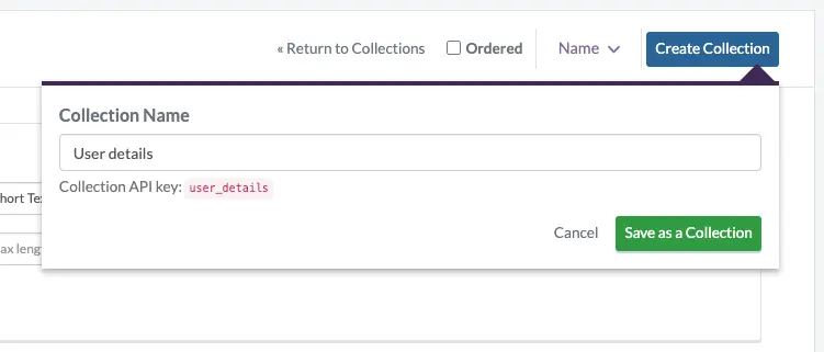
Next, click on the “Create Collection” button and enter “User details” as the name of the collection:
Next, click on the “Save as a Collection” button to save the collection.
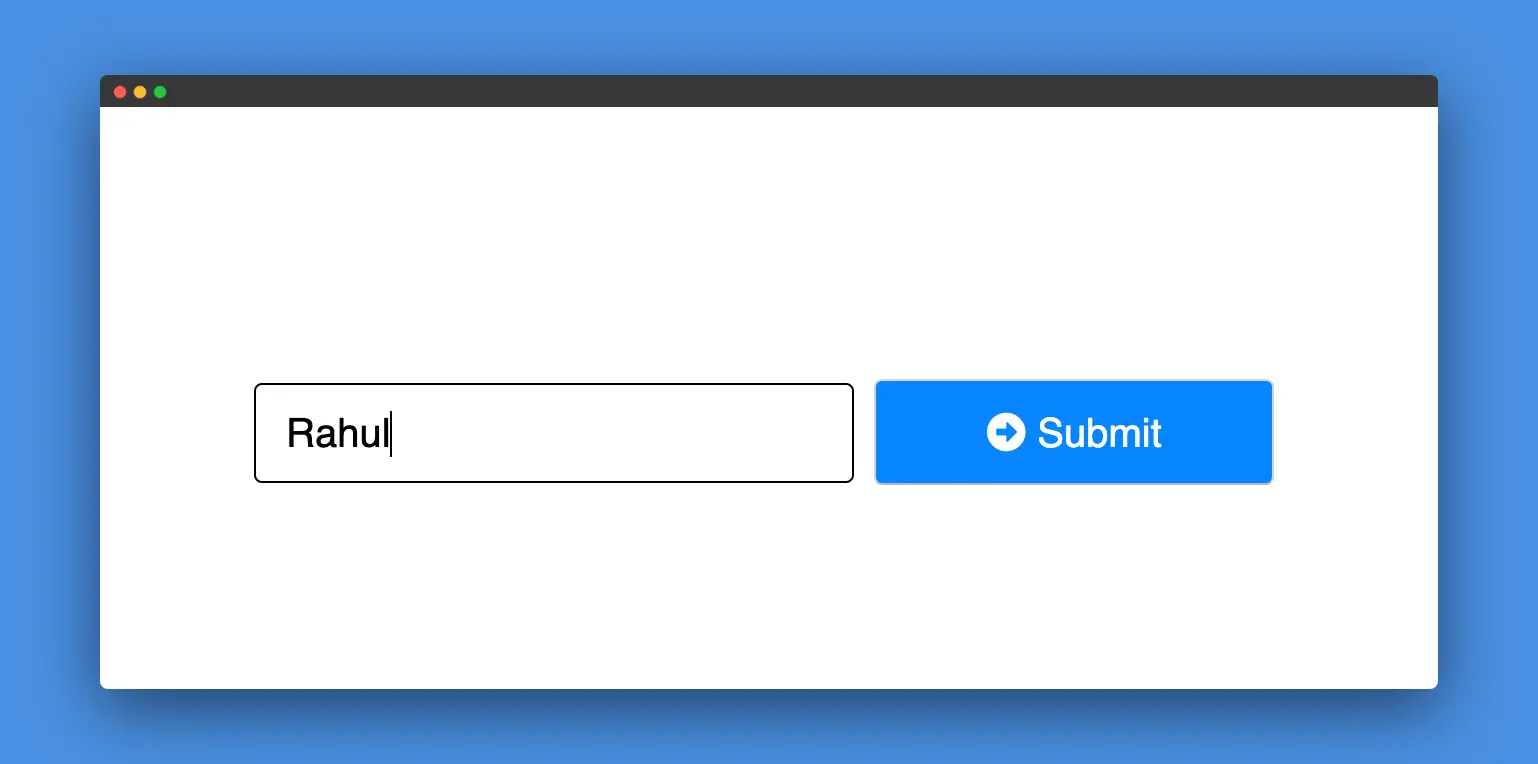
Now, you can type on the input box of the form and click on Submit. That should save the data to ButterCMS collections.
Now, if you go to collections, you can see that the details have been saved:
You can check out this CodeSandbox to view the implementation of this whole process. You’ll need to enter your ButterCMS Write API Token (which can be found in your settings) in the `butter-cms-api-call.js` file.
Closing thoughts
As you can now see, you have made a pretty reusable React Button component. You can use the same idea to build a component in React. The whole code is also available on CodeSandbox.
The main idea behind reusing components is that it gives you the confidence to ship consistent and tested features faster. It helps your user feel accustomed to the whole website.
If you’re looking to streamline your development even further, check out the ButterCMS React starter project, which offers pre-built components designed to streamline your development process.
I hope this tutorial helps you in your future projects. Please feel free to share your feedback in the comments section below.
Learn to build a serverless React application in our new blog post on how to use serverless in practice.
ButterCMS is the #1 rated Headless CMS
Related articles
Don’t miss a single post
Get our latest articles, stay updated!


Nirmalya Ghosh is a Frontend Developer and Designer based in India. He likes good design and is currently working mostly with React. You can find more details about him at nirmalyaghosh.com.